Disclosure: this post contains affiliate links, including Amazon Affiliate links. An affiliate link means I may earn an advertising fee if you make a purchase through my link without any extra cost to you. This helps to keep this little blog alive, so thank you! For additional information, please view my privacy policy.
I love the idea of a photo gallery wall. They display life’s most treasured moments in a personal and creative way. And can be changed up as many times as you like as you hit different life milestones.
But photo gallery walls can look messy, complicated and can be a bit intimidating to put together. Believe me, I know. We’ve been in our house for 16 years, and in that time, I have NEVER hung up a single family photo!
Not once. GASP! Blasphemy!
I think there are two reasons for this. First, as I’ve mentioned in the past, I’m a wannabe minimalist. While I didn’t consciously avoid hanging photos on my walls because of this, I’m sure that the thought of visual clutter was gnawing at me in the back of my mind.
Second, I’m not really a sentimental kind of person. Which is a bit odd I think. I am very family-oriented and I’m a wedding and event planner. You would think that this would mean I’m all into treasuring and displaying life’s beautiful moments and memories.
But I have found that this is just not the case with me. Hopefully all that means is that I choose to live in the moment and relish the now. *hehehe…nervously tugging at my collar and going through a minor moment of inner reflection over here*
In any case, I FINALLY got my act together. I spent about two weeks going through all the beautiful family photos we have, and took the plunge in getting them up on our walls!
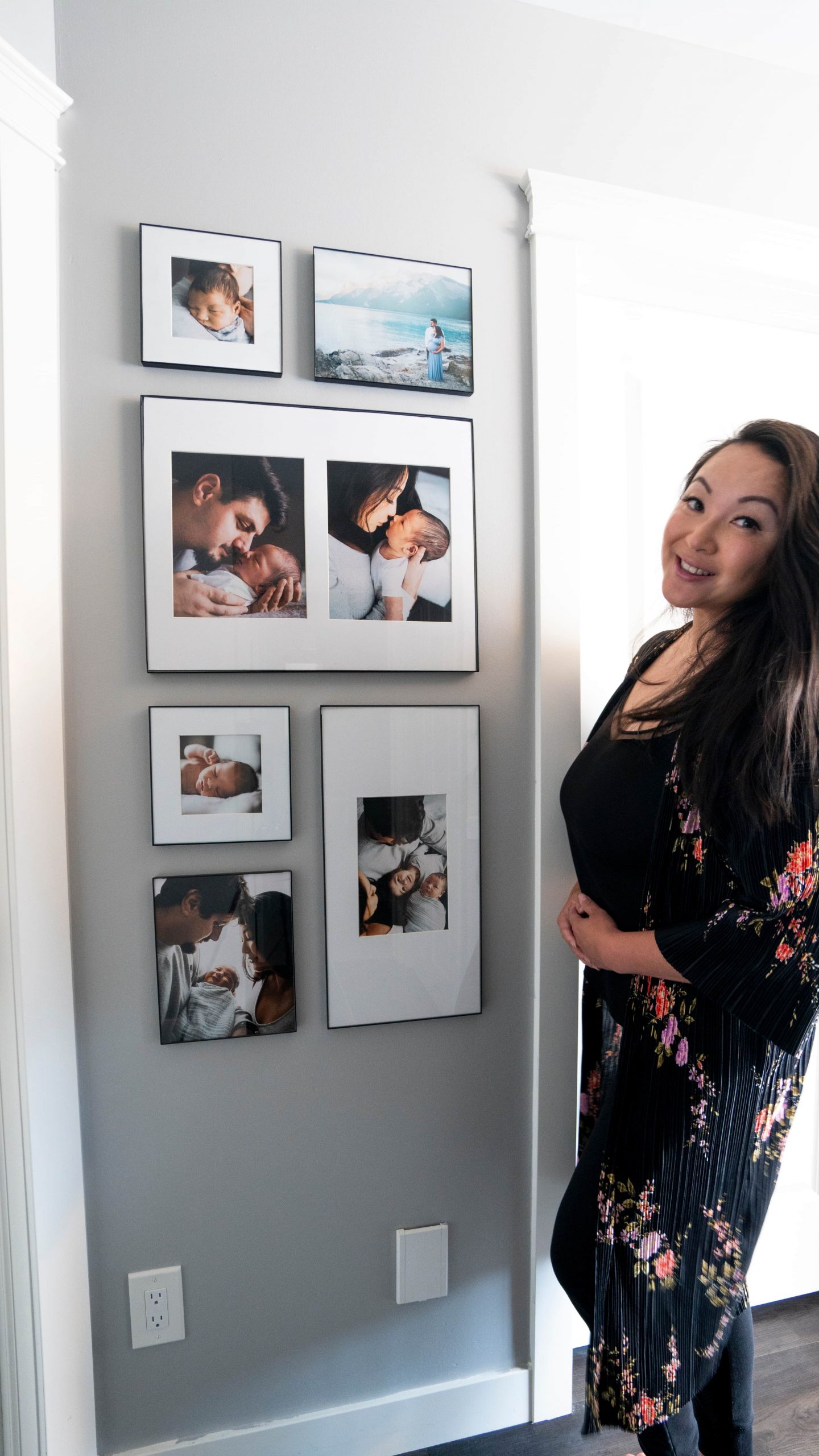
Today, I want to show you how to do a photo gallery wall right! At least right in my personal opinion: minimalist, structured, and streamlined.
Here’s my guide to how I created my minimalist photo gallery wall, with all my tips and tricks so that you can do it too!
Decide on a location for your photo gallery wall
Obviously this is an important step. If you’re like me and don’t live in a huge mansion, wall space may be limited. Since I worry about cluttering up my walls, I generally opt to keep most of them bare.
Most guides will tell you that you need one large blank wall to effectively create a photo gallery display. Well, to this I say PISH POSH!
Photos and frames come in all shapes and sizes, so if you only have a skinny wall to work with, then simply select your photos and frames to scale.
In my home, there were only a couple key spots I thought to create a display. Here they are below, along with some inspo from others in the blogosphere to help stimulate your own ideas!
The staircase
We have a lovely staircase leading to the upstairs level. It’s vaulted, allowing for lots of wall space for a potential gallery.
This staircase gallery wall by Missy over at Sapphire Diaries is to die for! I love the use of larger frames since it is such a large wall, and I love the organic layout used here. Although Missy uses different frame colours, her display maintains unity by having all the photos printed in black and white.
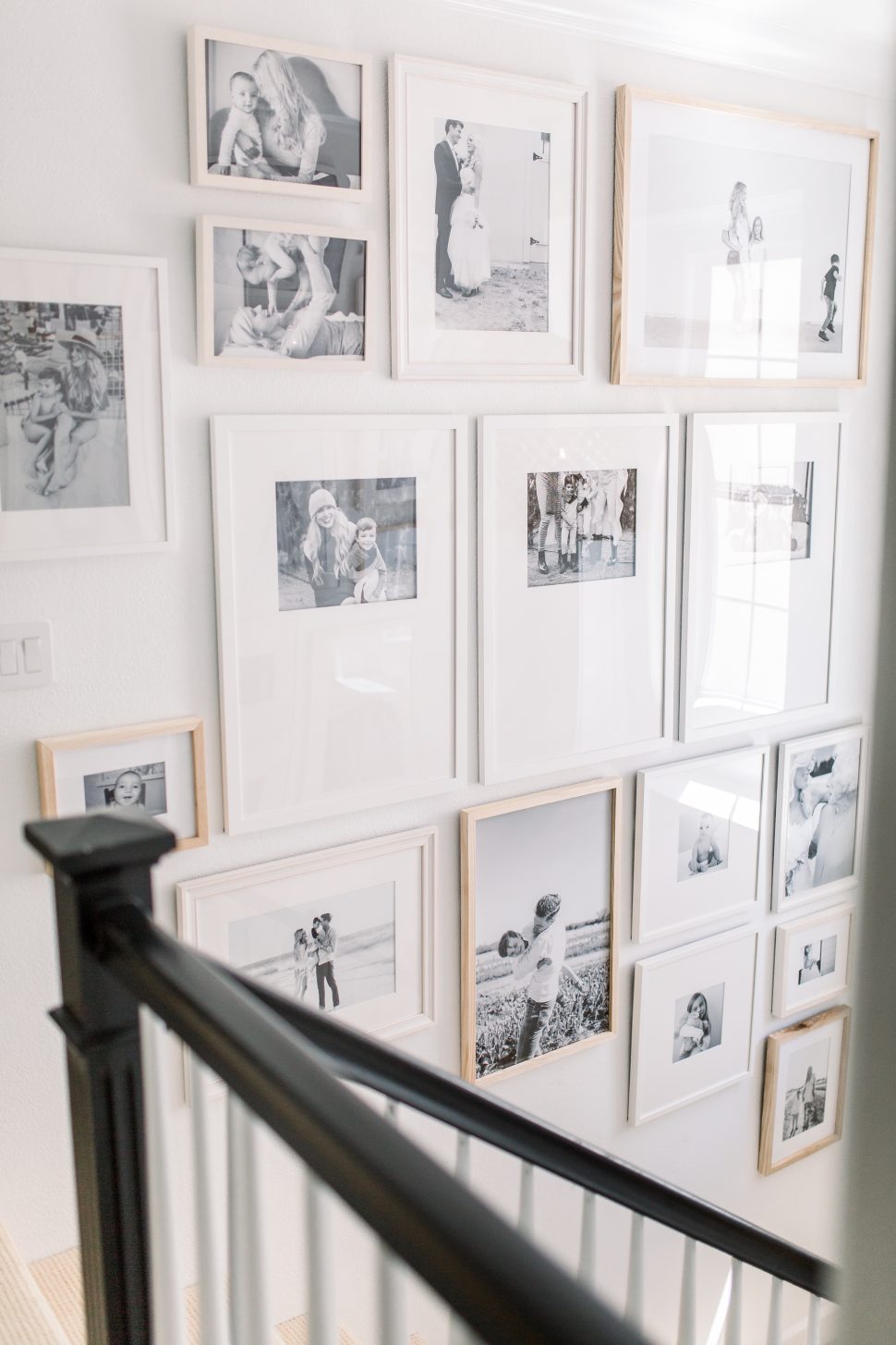
I really love what Amy Peters did with her staircase gallery wall display. Again, because the wall is so large, she uses large frame sizes. I love the structured grid layout used here – it’s simple for the eye to take in but still delivers a huge design impact.

The longer hallway leading to our powder room
In our small home, this is probably the longest hallway wall we have. Long hallways are beautiful spots to create a gallery wall.
This long hallway display of photos is my dream! This is a project by Studio McGee. Shae just does everything right and who doesn’t love absolutely EVERYTHING that she puts together!?

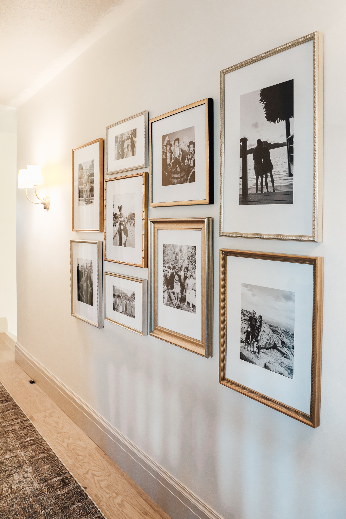
I love Chris and Julia of Chris Loves Julia and everything that they do! Really love the way they chose to do their gallery wall in their hallway. The frames are all a little different, but are all of the same colour family. Printed photos in black and white is essential here so as to maintain a level of unity between all the photos.
The dining room
The wall in our dining room is also a great large wall where I could have created a display. Currently, we have a gorgeous custom piece of art created by a talented local artist on this wall, and it is there to stay!
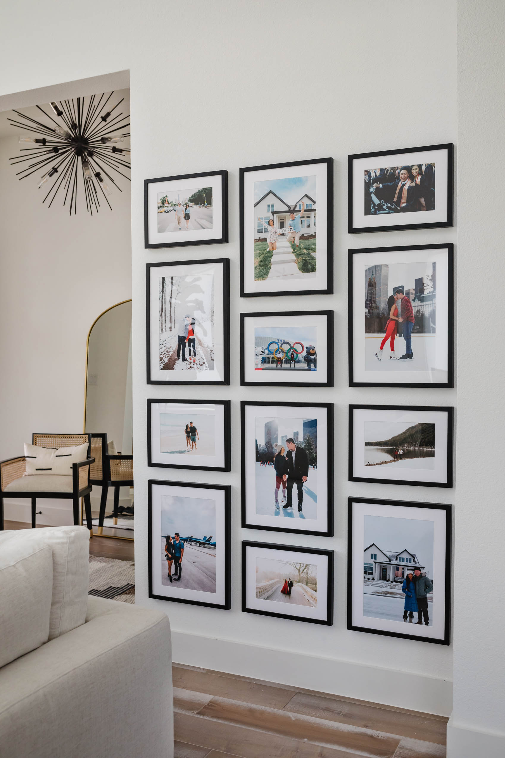
I am a little obsessed with this streamlined and structured display that Hoang-Kim of Color and Chic created in her living room. I like the use of different frame sizes, but that they are all the same type and colour of frame to maintain cohesiveness.
I’m loving this picture ledge idea by Vivienne of Feel Wunderbar. Using picture ledges makes it so easy to switch things out if you want to. It also allows you to stack different sized frames for a more casual but chic look.

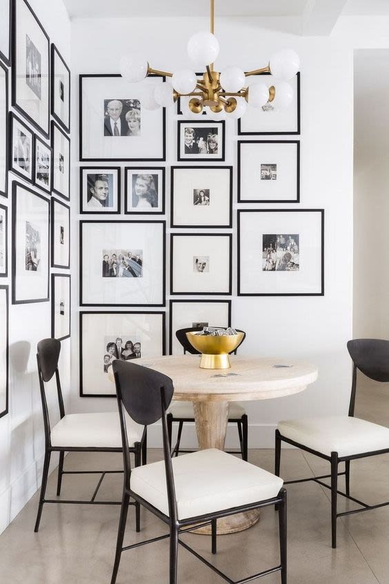
And I LOVE this display in this eating nook by Nicole Davis Interiors and featured on Gray Malin. I love the clean and minimal look of using oversized mats. And the way the photos beautifully wrap the inner corner of the wall is absolute perfection!
The back entryway through the mudroom/laundry room
With small houses come small mudrooms. Ours is pretty small…and also functions as the laundry room. For years I have had intentions to create an eclectic display on the wall that incorporates the coat hooks and fun family mementos.
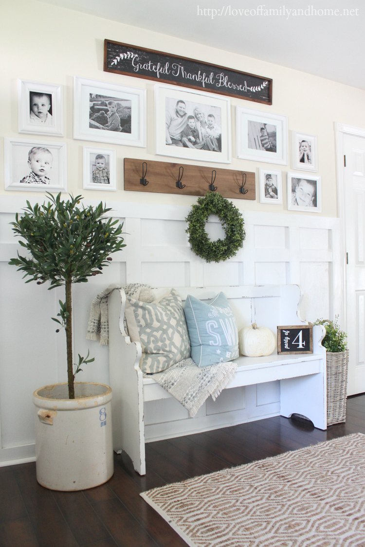
I think what Tonya of Love of Family and Home did with her entryway is really adorable and functional.
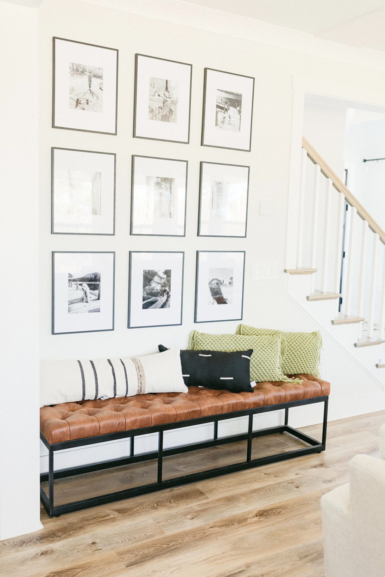
This sleek gallery wall display over an entryway bench by Taralynn of Simply Taralynn is right up my alley! Again, utilizing black and white photos creates unity in all the pictures. And the grid layout is a classic that can never go wrong.
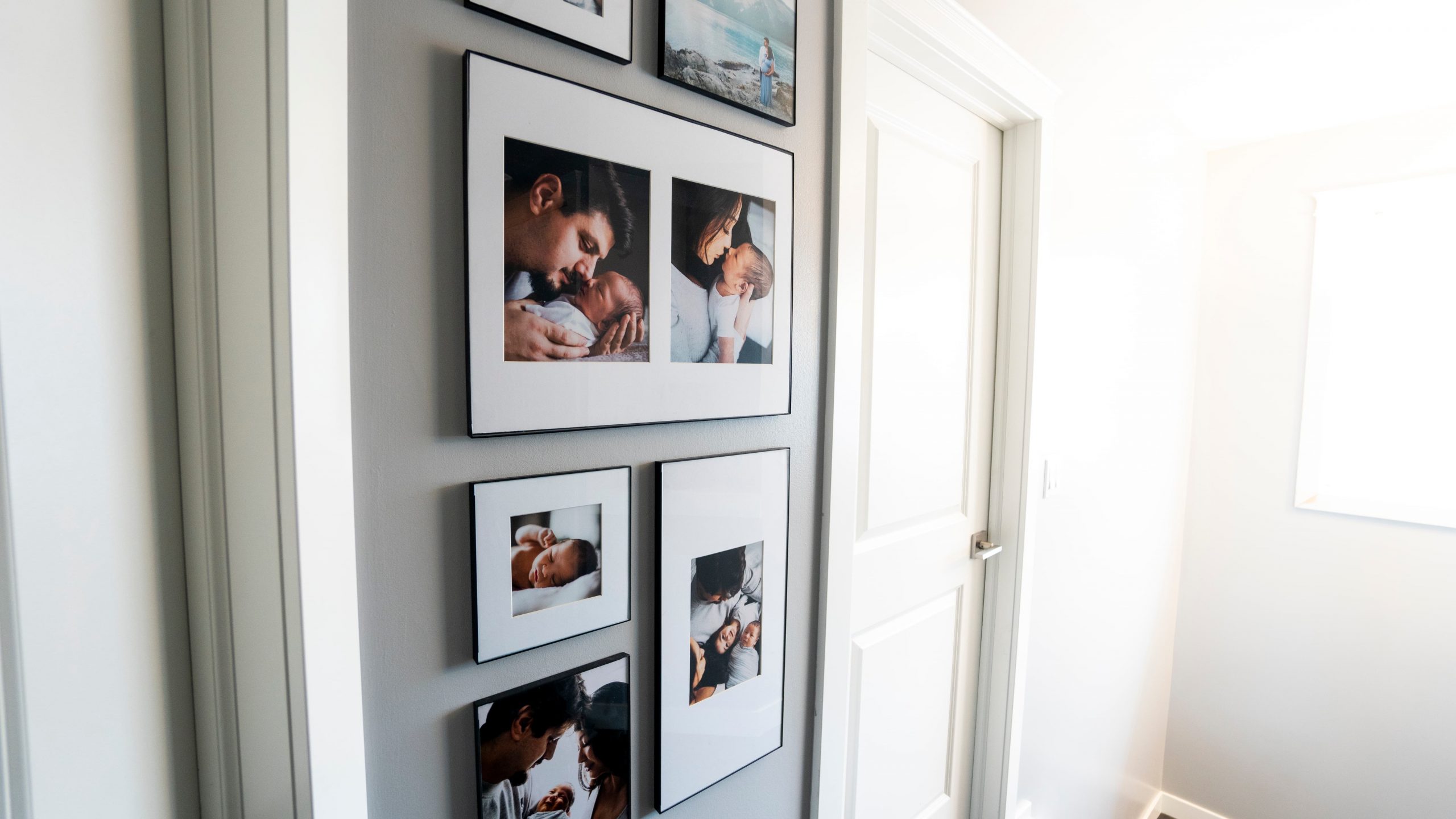
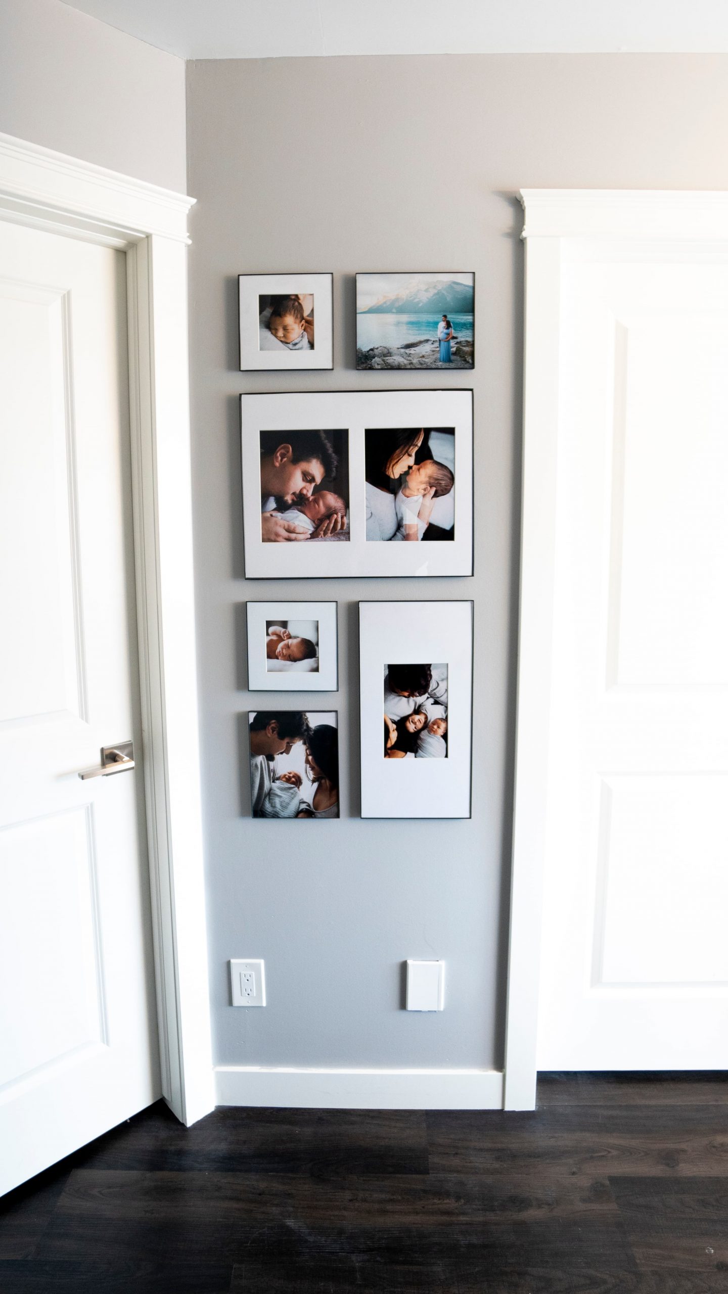
Ultimately, I chose kind of an obscure location. I chose to display a photo gallery on the skinny wall between our two boys’ bedrooms.
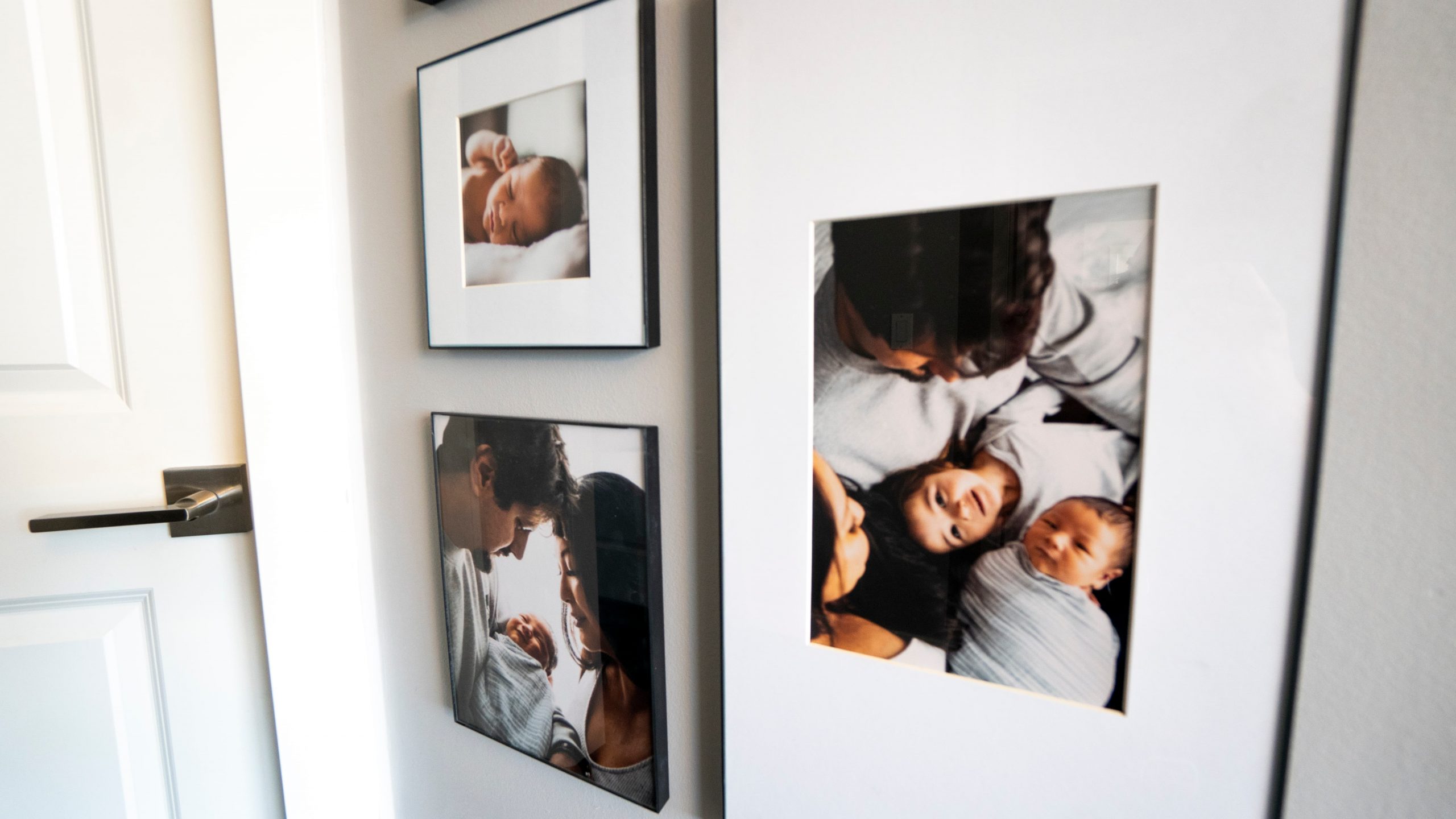
I chose this location because it’s not in any main entertaining space. For some reason I have a thing about displaying personal photos in spaces where guests will frequent. I don’t know why I have this hang-up…I think I read that it was bad feng shui in some article once, I don’t know. But displaying our family photos in our “sleeping quarters” solves this for me!
You do you and pick what works for your family! There is not really a wrong answer here.
Pick a theme for your photo gallery wall
To keep things looking clean and streamlined, I highly recommend picking one theme for your display and sticking to it.
For my display, I chose to stick to photos taken at each baby’s newborn shoot.
These photos were taken by my talented brother, who also did our maternity shoot in the Rocky Mountains. Lucky for me, with the same photographer, shot composition and editing style will be the same and that automatically keeps things consistent visually.
Besides selecting photos from one life event or by one photographer, here are some other ways that you can stick to a theme:
Print all photos in black and white – This is the easiest way to ensure that everything looks unified. No matter what is in your photo, when everything is printed in black and white, any potential chaos and clutter will be visually eliminated.
Feature one subject matter in all photos – Choose to feature a wall with just your dogs. Or your children. Perhaps your family on that one epic vacation to the Bahamas. Or you and your spouse sharing the same kissing pose in different places.
Whatever the subject, try to stick to just one.
Use the same frames – While I appreciate an eclectic and organic gallery wall, in keeping with a streamlined and minimalist look, I recommend picking one style of frame only.
If you’re using different frame shapes, then make them all the same colour.
Use the same colour mats – This might be an overlooked step, but I think it’s really important to pay attention to the type of mat you have for your photos. Personally, I think a crisp white smooth mat board looks best for any frame and photo.
Whatever colour and finish of mat board you choose, stick to just one.
Choose a layout for your photo gallery wall
This part is the MOST important step, and it can be the most daunting. There are just so many ways you can do this!
Once I decided where my gallery was going to go, I measured the width of the wall and selected the largest standard size frame that would fit there. My wall is 24″ wide, so I determined that a 16×20 frame in landscape orientation would be the largest I could go without it looking unbalanced.
For more layout ideas, below are a few great ones by Sigrid & Co. Also, check out these articles from Pottery Barn and Paper Stories.

Gather everything you need for your photo wall
Frames
Frames are such a key detail for making a photo gallery wall look right. I looked EVERYWHERE for the right frames. I wanted all the frames to be from the same “line”, although you don’t have to do this. It was just my preference (and my OCD kicking in).
I LOVE the Icon wall frames from Crate and Barrel. These are my absolute fave! But given the space I was working with, they didn’t have all the sizes available for me to execute my look.
The black gallery frames from CB2 are another beautiful option. But for the same reason as above, the sizes available weren’t going to work with my location.
As always, Amazon is another amazing place to grab some great frames. I really like these black sleek aluminum frames. They are at a great pricepoint, and the frame is nice and thin so as not to be overbearing on your photos.
I also like to shop at Homesense/Winners/Marshall’s/Homegoods for frames. They carry really great ones, but it can be challenging and time-consuming to find the exact ones you want. Especially if you are looking to create a larger gallery wall.
For a gorgeous bespoke option, Framebridge is a full-service company that produces ahh-mazing looking gallery walls for you. You can give them the wall space you are working with, and they will create a custom layout. You can also upload your digital photos and they will take care of printing and framing all in one shot. Be prepared though, and clutch your pearls. Because this option is SPENDY!
I surprised myself when I ended up opting for the most basic and cost effective frames from Michaels! They had all the sizes I needed, and the frames are super thin, lending to the minimalist look I was going for perfectly! I did have to do a little DIY work to achieve the final look that you see here. But it was worth it. Check out the HOW TO here.
Photos
I always use online printers for my photo prints. This way, I have lots of reviews to fall back on, can spend my time thinking about paper selection and photo sizes, and I like that everything gets shipped right to my door.
For quick turnaround prints and photos, I print through Costco. I like printing on their matte photo paper and their pricepoint can’t be beat. However, I can only recommend Costco if you are not picky about accurate colouring and detail. Based on my experience, I find that Costco photos come out a lot darker and you lose some fine detail as a result.
Shutterfly is highly rated for digital prints. I have yet to print with them, but I do have a batch of photos I want to test out with them next. I will update this once I have my prints in hand and can provide a proper recommendation (or not).
For my gallery wall photos, I used Printique to print. I love the paper selection they have, and most of them are for no additional charge. Once your photo is uploaded, you can crop to fit within the size you specified. Printique offers free colour correction service as well.
The prints I received from Printique were INCREDIBLY well-packaged. Something that I greatly appreciate. I printed all my gallery wall photos on their silk paper and the photos turned out stunning. The one downside to Printique would have to be their shipping cost. It’s a lot. But their price per print is quite low, so I bit the bullet and paid for the $30 shipping cost. I feel like I still came out on top.
Other decor items to display
I always toyed with the idea of adding tchotchkes and fun objects to my gallery walls.
At the end of the day, I continued to gravitate to my minimalist preferences and decided not to add these things. I do think they are so fun though and am still open to creating a gallery wall one day that is eclectic and fun! I just have to find the right spot for something like that.
Some fun ideas for items I’ve seen and love are:
- decorative letter to represent the family initial
- large scrabble tiles to spell out the family name or some other quote
- antique keys
- dinosaur and animal heads/busts in a glamorous metallic finish
- a clock
- antique door knockers
- mirrors
To maintain a minimalist look, I would suggest that you choose only 1 or 2 fun items and that they are on the smaller side so as not to be distracting. Moreso, they want to act as a light fun and whimsical touch to your overall display.
Hanging tools
Thanks to innovation, gone are the days of making holes in the walls to hang art! I love using 3M Command Picture Hanging Strips for all our art and photos. The beauty of these is if you make a mistake, you can cleanly remove the strip and start again!
I HIGHLY recommend using a level and measuring tape to ensure your photos are spaced properly and that they are level. This nifty tool will take care of a lot of your picture hanging needs!
Depending on what you’ve decided for your layout, you may not want to skip out on having large pieces of paper and masking/painter’s tape and a pencil on hand to help place everything.
Hang everything up on your wall
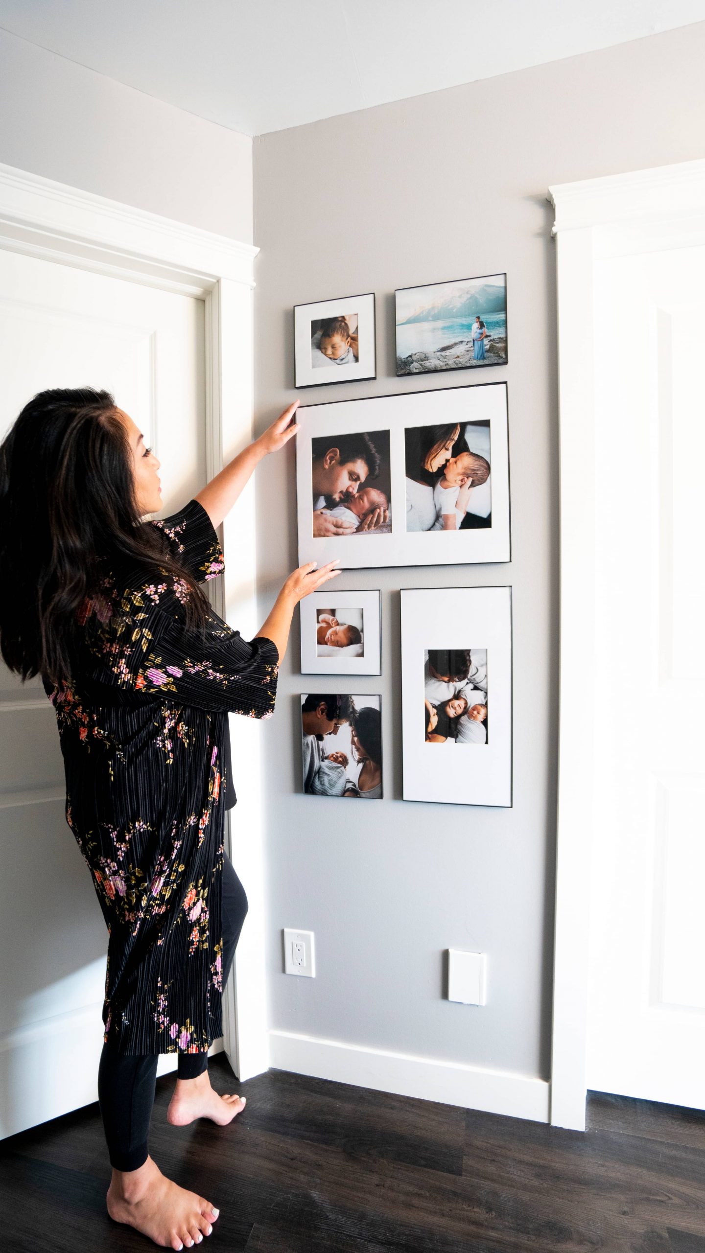
For my gallery wall, I started with the large 16×20 frame first. I determined the appropriate height for it on the wall by eye and made a tiny mark on the wall with a pencil along the top of the frame.
I would recommend for you to then use your level and adjust the line as needed (I didn’t do this…). Then apply your Command Picture Hanging Strip to the back and put up the picture.
From here, I continued working outwards with my other pictures as per the sketch I did up.
All the photos are spaced with a 2″ distance between them.
Stand back and admire your new photo gallery wall
After completing my display, I kicked myself a little for not doing this way sooner. That’s how it is with all things in life I guess.
This was so simple to do once I got my head around it and just dove in. I love walking by this display and taking a second to admire the photos and the memories. Lincoln also stops at the gallery wall and points and names everyone in each photo. Oh melt my heart.
I encourage you to go and give this a try and get those memories up!
— Shop The Post —
Be sure to Pin this post for when you’re ready to create your own photo gallery wall! And link or tag back to me when you do! I would love to see how it turns out 🙂

